Table of Contents
ToggleNavy blue kitchen cabinets have become a go-to choice for homeowners who want something bolder than white but more timeless than trendy grays. Unlike the stark contrast of black cabinets or the dated feel of oak, navy strikes a balance, it’s sophisticated, grounded, and pairs beautifully with nearly any countertop or backsplash. Whether you’re planning a full cabinet refresh or updating existing cabinetry with paint, understanding how navy works with lighting, hardware, and surrounding materials will make the difference between a stunning transformation and a disappointing reno. Here are the design strategies that work, plus what to avoid.
Key Takeaways
- Navy blue kitchen cabinets offer a timeless, sophisticated balance between classic style and contemporary design, resisting both dated trends and showing less wear than white alternatives.
- Pair navy blue kitchen cabinets with white marble countertops and light subway tile backsplashes for a modern aesthetic, or combine them with warm wood and brass accents for traditional elegance.
- Proper lighting is essential when installing navy cabinets—use warm white LED undercabinet lighting (2700–3000K) and layered overhead fixtures to prevent the space from feeling dark or cave-like.
- Choose brass, champagne bronze, or brushed gold hardware finishes to complement navy cabinets, as these warm metals prevent the color from appearing flat and work across both traditional and contemporary styles.
- Balance navy cabinets with lighter or warmer flooring in cream, light gray, or honey-toned wood, and keep wall colors neutral or soft to allow your cabinets to serve as the kitchen’s main focal point.
Why Navy Blue Is The Perfect Cabinet Color Choice
Navy blue cabinets tick multiple boxes that explain their resurgence in kitchens across North America. First, the color reads as classic without feeling dated, it worked in 1960s kitchens, works today, and will work a decade from now. Unlike white cabinets that show every fingerprint and dust streak, navy hides everyday wear and scuffs, making maintenance realistic for busy kitchens.
The color also sits in a sweet spot between cool and warm undertones. True navy (not steely blue or grayed-out blue) has enough warmth to feel welcoming but enough depth to suggest quality and intentionality. This is why navy cabinets often photograph beautifully and feel luxurious in person, even when paired with modestly priced hardware or countertops.
From a resale perspective, navy has proven more resilient than trend-driven colors like sage or blush. Buyers see it as a finished, confident choice rather than a statement or risk. That said, this is a cabinet color, it’s a commitment. Make sure you’re genuinely drawn to navy, not just following 2026 design forecasts.
Pairing Navy Cabinets With Countertops And Backsplashes
The magic of navy cabinets happens at the intersection with countertops and backsplashes. Wrong pairings can make a kitchen feel cold or heavy: smart choices elevate the whole space.
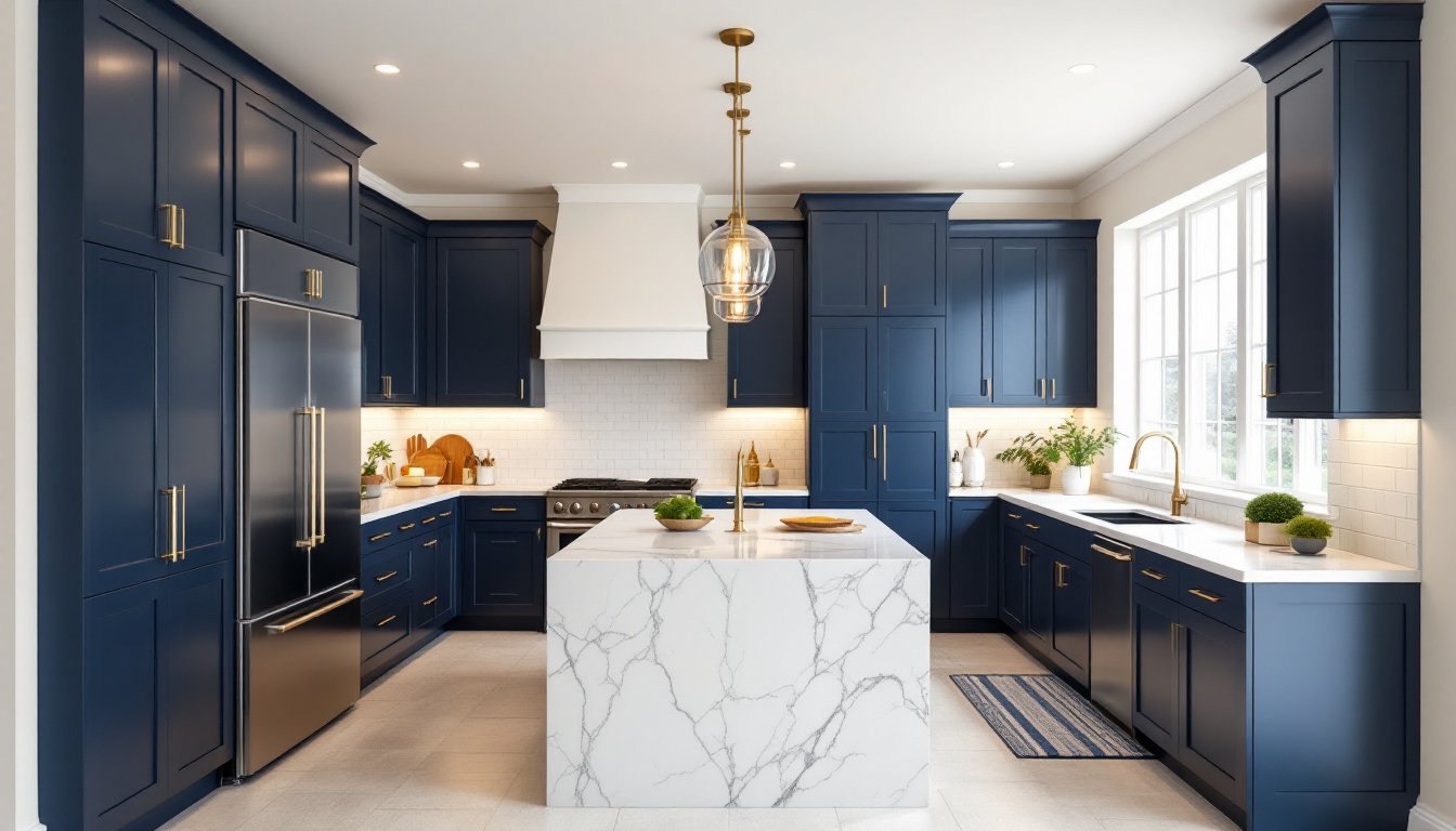
White And Light Marble Combinations
White or cream countertops with light marble veining create the highest contrast and the most visual interest. This pairing makes navy feel more modern and sharp, it’s the setup you see in contemporary design magazines. Honed marble (matte finish) against navy reads more sophisticated than polished (shiny) marble, though either works if the marble has subtle veining rather than bold, dramatic patterns.
For the backsplash, small white subway tiles or white hexagon tiles echo the countertop and prevent the eye from getting lost. If you want pattern, look for light blue-and-white geometric or Moroccan-style tiles that pull the navy forward without competing. Keep grout light, white or off-white, to maintain the clean, open feel. Avoid dark grout pairings with navy: they tend to shrink the space visually and create a heavier aesthetic.
Warm Wood And Brass Accents
Warm wood countertops (walnut, cherry, or honey-toned oak) create an entirely different mood with navy, less modern gallery, more traditional elegance. This combination feels cozy and grounded, especially in kitchens with natural light coming from multiple angles. The wood adds visual warmth that softens navy’s cool undertones.
Pair warm wood with a backsplash in warm cream, soft gold, or terracotta-toned tile. Handmade-looking tiles with slight color variation (instead of machine-perfect uniformity) work beautifully here. If you’re adding new hardware, brass, bronze, or warm copper pulls and knobs will complement both the navy and the wood. Remodelista and similar design sources regularly feature navy-and-wood kitchens because the combination has proven durability and visual appeal.
Lighting Solutions For Navy Blue Kitchens
Here’s where many navy cabinet installs falter: insufficient or mismatched lighting makes navy feel dark, cave-like, or even dingy. Navy absorbs light more than lighter cabinet colors, so you’ll need deliberate illumination planning.
Underway cabinet lighting (LED strips mounted under wall cabinets shining down onto the countertop) is non-negotiable. Choose warm white or soft white LEDs (2700–3000K color temperature), not daylight-cool 5000K options that clash with navy’s warmth. Underway lights serve a functional purpose, they illuminate the work surface, and an aesthetic one: they add visual depth and prevent the cabinets from looking like a solid navy mass.
Overhead lighting should include recessed downlights (again, warm white) distributed across the ceiling, not clustered in one area. If you’re renovating and opening up the ceiling, pendant lights hung at 30–36 inches above the kitchen island work well. Brushed brass, bronze, or even matte black pendants pair seamlessly with navy.
Windows and skylights matter too. If your kitchen faces east or south and gets decent natural light, navy cabinets look richer and more inviting. North-facing kitchens with limited natural light benefit even more from layered artificial lighting, ambient ceiling lights, task lighting over work zones, and accent lighting inside open shelving or glass cabinet doors.
Hardware And Finish Options That Complement Navy Cabinets
Cabinet hardware is the jewelry of your kitchen, and it can either harmonize or clash with navy cabinetry. The finish you choose communicates the entire design direction.
Brass and warm metals (champagne bronze, warm brass, and brushed gold) are the safe and sophisticated choice. They echo warmth and catch light in a way that prevents navy from feeling flat. Brass hardware also bridges traditional and contemporary styles, making it a flexible choice if you’re uncertain about your overall kitchen direction.
Matte or brushed black hardware creates modern, high-contrast looks with navy. This pairing works best in kitchens with clean lines, minimal ornamentation, and plenty of white or light surfaces elsewhere to balance the darkness. Glossy black is riskier, it can feel dated or harsh depending on the navy shade and surrounding materials.
Stainless steel works but reads more commercial and less warm. Reserve it for kitchens where appliances are also stainless and the overall aesthetic is transitional or modern, not farmhouse or traditional. The Kitchn frequently showcases navy cabinet setups with a variety of hardware choices, offering real-world photos that can guide your decision.
Pull and knob style matters less than finish: choose oversized pulls (8–10 inches) for a modern look or smaller, recessed pulls for a streamlined, contemporary feel. Shaker-style cabinet doors pair better with understated hardware: detailed or raised-panel doors can carry more decorative hardware.
Flooring And Wall Treatments To Balance Navy Cabinetry
Navy cabinets are the anchor of your kitchen’s color story, but flooring and walls provide context and breathing room. Getting these wrong can make even beautiful cabinetry feel oppressive.
Flooring should be lighter or warmer than navy to create visual separation. Light gray, cream, honey-toned wood, or natural stone tile keeps the eye grounded and prevents the kitchen from feeling top-heavy. Avoid dark flooring (charcoal, black, or very dark gray) unless your kitchen is large with excellent lighting, the combination of dark cabinets above and dark flooring below shrinks the space and can feel gloomy.
Wall color is equally important. White, cream, or very soft warm gray walls allow navy cabinets to be the star without competing for attention. If you want color on walls, consider a barely-there warm white with slight yellow undertones (sometimes labeled “cloud white” or “ivory”), not cool whites that accentuate navy’s coolness. Some homeowners use soft blue or pale blue-gray walls with navy cabinets, but this works only if the wall color is significantly lighter and the kitchen gets strong natural light.
Backsplash functions as both functional and decorative. As discussed earlier, white subway tile or light marble-look tile is the classic pairing. If you prefer pattern or color in the backsplash, ensure it includes white or light tones to avoid visual competition. Homedit and similar resources showcase dozens of navy cabinet installations with various backsplash and wall treatments, offering inspiration for balance and proportion. Remember: navy cabinets are bold enough on their own: let them be the focal point rather than competing with equally bold walls or flooring.